In this post i will show you how to create a nice progress chart to show percentage data in a nice way. We use VictoryPie and the standard svg tools to achieve this with great flexibility.
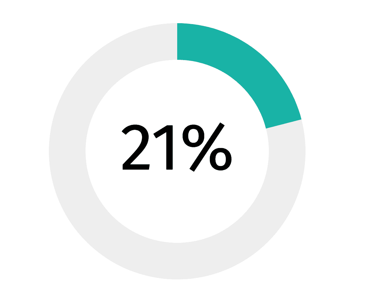
The resulting progress chart with VictoryPie in React
React is really great in terms of using components and connecting them to create a strong piece of software. This also makes ist fairly easy to create and maintain plugins. One plugin, that i use very often, is Victory. It is an library to create charts with high flexibility and good documentation. Thanks to the guys from Formidable!
To get the chart as shown above, we first have to create the chart. This is done pretty simple by following code:
import {VictoryPie, VictoryTheme} from 'victory';

<VictoryPie
    padAngle={0}
    // used to hide labels
    labelComponent={<span/>}
    innerRadius={70}
    width={200} height={200}
    data={[{'key': "", 'y': this.state.metric}, {'key': "", 'y': (100-this.state.metric)} ]}
    colorScale={["#19B3A6", "#EEEEEE" ]}
/>
With this code you create a pie chart with space in the middle and two datasets, one to display the current value and one to show the rest. It was designed to display percentage data between 0 and 100. If you want to work with data, that can be bigger than 100, you should exchange the 100 in the example. We could also use an constant for this, but it was not necessary in my case.
In the next step, we will surround the pie chart with an svg element and put some text into the center of it. This is possible, because we have created an VictoryPie element with an fixed size.
<svg width={200} height={200}>
  <text x={100} y={110} textAnchor="middle" >
    {this.state.metric}%
  </text>
  <VictoryPie
      padAngle={0}
      // used to hide labels
      labelComponent={<span/>}
      innerRadius={70}
      width={200} height={200}
      data={[{'key': "", 'y': this.state.metric}, {'key': "", 'y': (100-this.state.metric)} ]}
      colorScale={["#19B3A6", "#EEEEEE" ]}
  />
</svg>
We also added an svg-text element to show the number and percentage and placed it via the x and y attributes in the center of the pie chart. In the last step you have to think about the size of the text, because the text can either have 1(6%), 2(21%) or 3(100%) numbers. But by placing it via x and y, the position is fixed.
That’s the reason why we are using textAnchor=”middle”. (Keep in Mind that you have to replace all HTML attributes with an “-” with CamelCase equivalents). It will use the center of our element as the anchor point to place the text. You can find more about this at the mozilla developer site.
And that’s it. Now you have an beautiful Progress Chart, that is also very flexible.